Base · the original product
A dump of charts
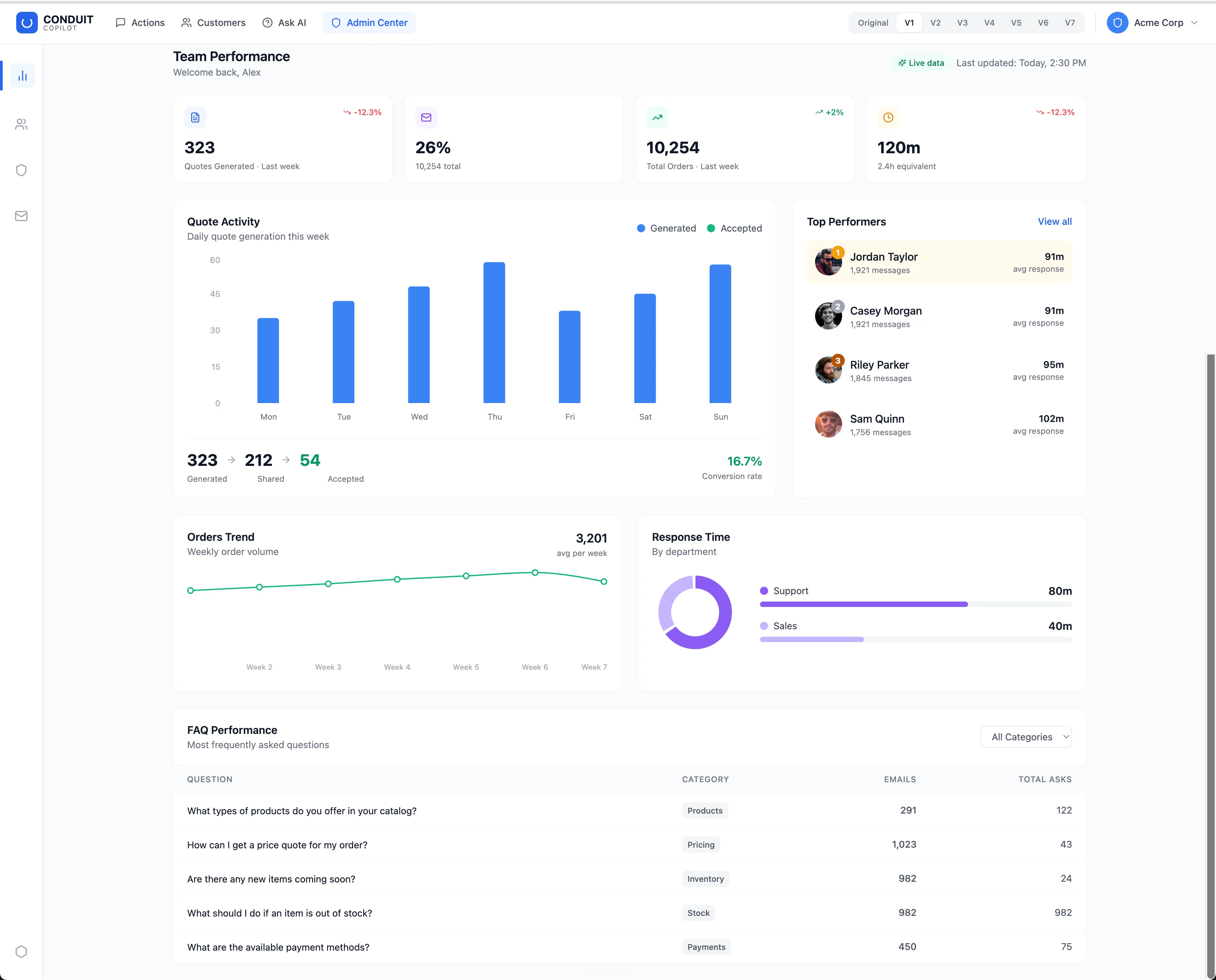
The starting product: 15+ metrics at equal weight, bars all the same height, mismatched time periods, a greeting where a headline should be. It answers no question in particular.
Case study · Agent skill
Most dashboards are a wall of charts — technically full, practically useless. So I built a skill that designs the opposite: it leads with the one decision a dashboard exists for, and puts a next step on every widget. It works like anavigator, not a prescriber — it pitches options, adapts to your stack and taste, and keeps the rich widgets that earn their place instead of stripping things to look “clean”.
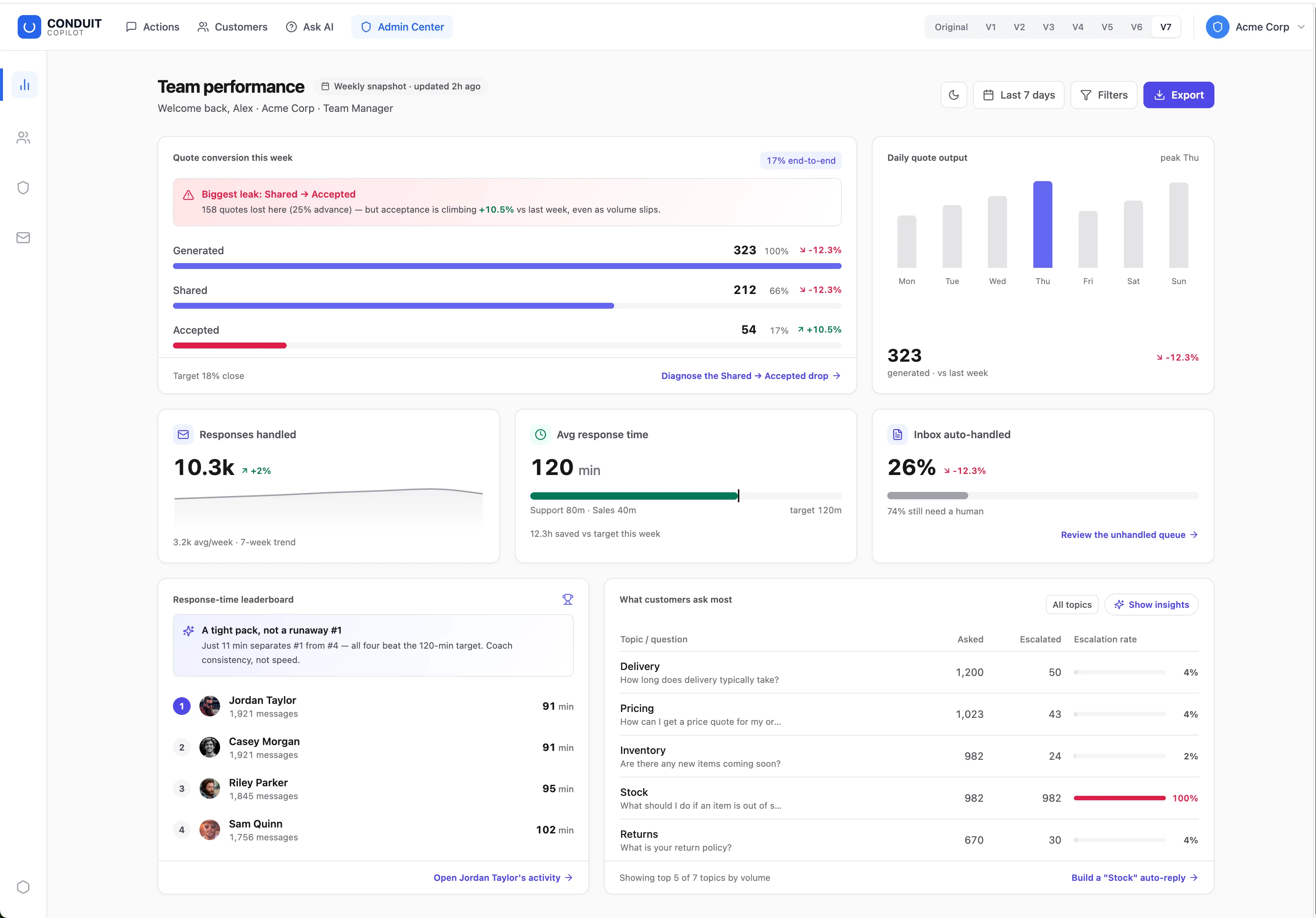
V1 is Claude's raw design intuition — no skill. V7is the same model with the skill applied. Same data, same screen. The gap between themis the skill.
V1 visualises the data. V7 interprets it — it tells the manager where to look and what to do next.
The grounding
The questions I built against from the very first pass — they hold whatever the stack, the charting library, or the domain. Click through to see each one.
A dashboard answers one question first — “what needs my attention?” The data serves that question; it isn't the point on its own.
Can a newcomer tell what matters here in five seconds?
One hero metric or question owns the top of the screen. A wall of equal-weight widgets has no priority, so the eye lands nowhere.
Is there a single, obvious focal point — or eight competing ones?
Title, chart, insight, action — each stays only if it supports a decision. Not minimalism; a ban on decoration. Rich widgets are welcome.
If I removed this, would the reader lose a decision?
A chart that only restates its own axis is wasted space. Say the thing a sharp colleague would say out loud — the cause, the anomaly, the implication.
Does this tell me something the numbers alone don't?
Every widget answers “so what do I do?” — a real drill-down into the actual segment, not a dead-end figure or a generic “view details”.
If this is bad, do I know where to go next?
Calm by default. Colour and alarm are a budget — spend them on the one or two things that are genuinely urgent, or nothing reads as urgent.
Is red reserved for what's actually on fire?
The iterations
Progress wasn't a straight line — it overshot into decoration before it settled. Same six principles, applied a little better each time (and once, worse). Click any frame to zoom.
The starting product: 15+ metrics at equal weight, bars all the same height, mismatched time periods, a greeting where a headline should be. It answers no question in particular.
Claude's raw design instinct with no skill applied: a tidy KPI grid on Recharts defaults — bar, line, two-slice pie. Genuinely better, but it still displays numbers rather than answering a decision.
Big, confident bars — that don't differentiate near-identical numbers. Warm fills make the whole page look urgent, so nothing is. An honest wrong turn, kept in because the mistake is the clearest lesson.
One hero question — where are quotes leaking? — answered by a clean funnel with the leak named in plain words. Every widget carries an insight and a real drill-down. Calm by default; red reserved for the one thing on fire.
The honesty check
It's easy to talk yourself into a redesign being better. So the test is adversarial: a fresh agent with no memory of the previous versionrebuilds the dashboard from scratch, handed only the skill and the original. If the blind rebuild lands in the same place, the principles are doing the work — not my attachment to a particular layout.
The same instinct runs through the skill itself: it doesn't self-attest that a design is good, it renders and measures the result — reading the real bars off the screenshot, checking contrast on the actual palette, testing the breakpoints. A dashboard isn't done because a box is ticked; it's done when the output has been looked at.
V1 → V7 · what the skill changed
A quick cheat-sheet — read each against the before/after.
V1Shows what: 323 quotes, 26% handled — true, but inert.
V7Leads with so what: “Biggest leak: Shared → Accepted, 158 lost — but acceptance is climbing +10.5%.” Every widget earns an insight or a next step.
V1Recharts defaults for everything — a two-slice pie, bars for every metric.
V7The medium fits the values: the leaderboard’s 91 / 91 / 95 / 102 (identical as bars) becomes ranked numbers + gap-to-target; the funnel is a clean stepped funnel, not the pointy default.
V1Lots of elements coloured, so nothing stands out.
V7A calm zinc baseline; red is spent on the one genuine alert (the leak, Stock’s 100% escalation) — so urgency actually reads.
V1No interpretation layer — just charts and captions.
V7Non-obvious findings sit in always-on banners; deducible ones hide behind a “Show insights” toggle. Hierarchy comes from containment, not loose coloured sentences.
V1A mockup: one state, light mode only.
V7Loading / empty / error states, full dark mode, tabular figures, accessible chart tables, responsive breakpoints — what separates a real dashboard from a screenshot.